Overview
Fortnox established a new team in Linköping to maintain and innovate the login system and develop a digital mailbox for entrepreneurs, allowing them to access and organize all their business mail in one place.
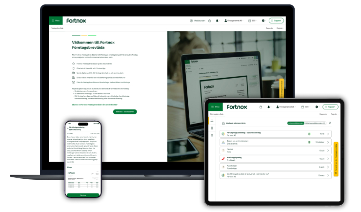
Fortnox established a new team in Linköping to maintain and innovate the login system and develop a digital mailbox for entrepreneurs, allowing them to access and organize all their business mail in one place.
Product Designer
User Research, UX design, Interaction design, Visual design, Prototyping & Testing
August 2021 - August 2024
Fortnox AB is a Swedish company that provides cloud-based solutions for accounting, invoicing, payroll, and other administrative services.
When I started at Fortnox in Linköping in August 2021, it was a small startup office with just 10 colleagues. There, I worked on two products: one involved updating Fortnox's login system, and the other was developing a digital mailbox similar to Kivra and Billo, but with a focus on providing a single place to gather all incoming company documents.
During my time at Fortnox, I focused extensively on user research and data collection while also contributing with concepts and design proposals for our products.
I've grown tremendously in my years at Fortnox, some key achievements of which I have listed below:
Before Fortnox hired a product designer, both the login platform and the digital mailbox had been implemented based on the “best to know practise” without any UX in mind.
I conducted research interviews with our primary users to uncover any pain points that they were experiencing with the previouse releases.
My research encompassed:
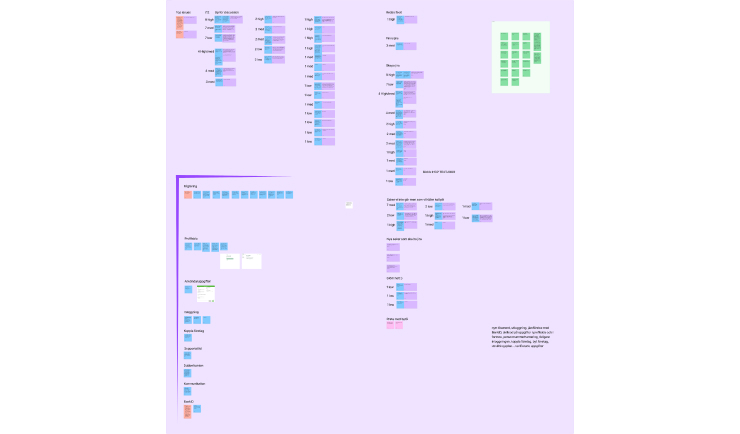
After collecting the recordings from the user interviews and data from insights, I conducted affinity mapping with my teammates to synthesise the pains identified. We grouped these problems under common themes and features in the products.

Collaborating with the Product Owner, I proactively categorized these issues within our ongoing tasks to ensure that Product Managers and developers had clear visibility into the key areas requiring attention from a usability perspective.
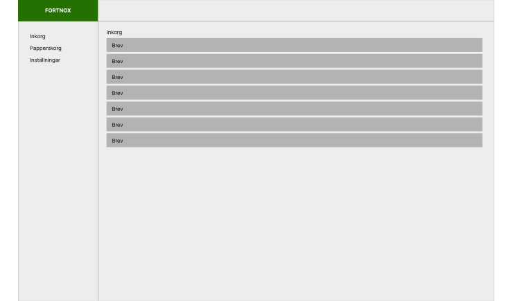
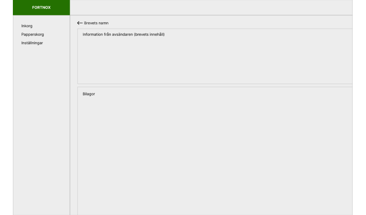
I mocked up some basic wireframes to gather feedback from the users and stakeholders. This involved establishing a standardized visual hierarchy and layout for our products.

I conducted usability testing sessions with our primary users to validate whether the new designs would solve their problems.
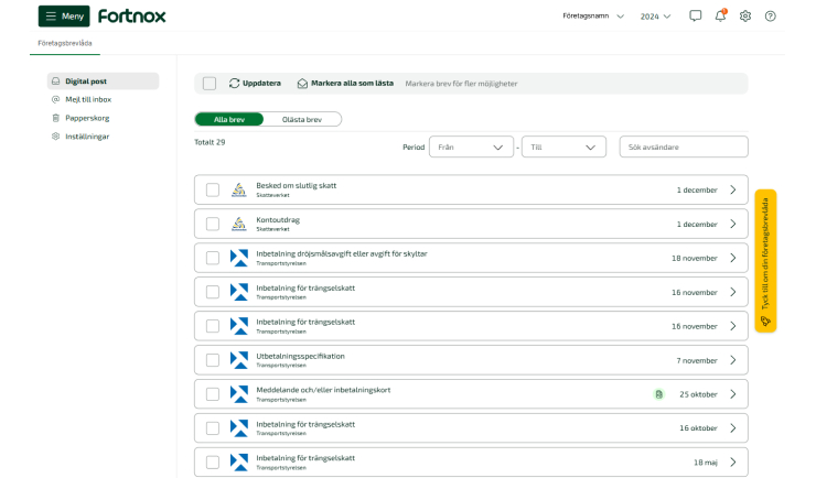
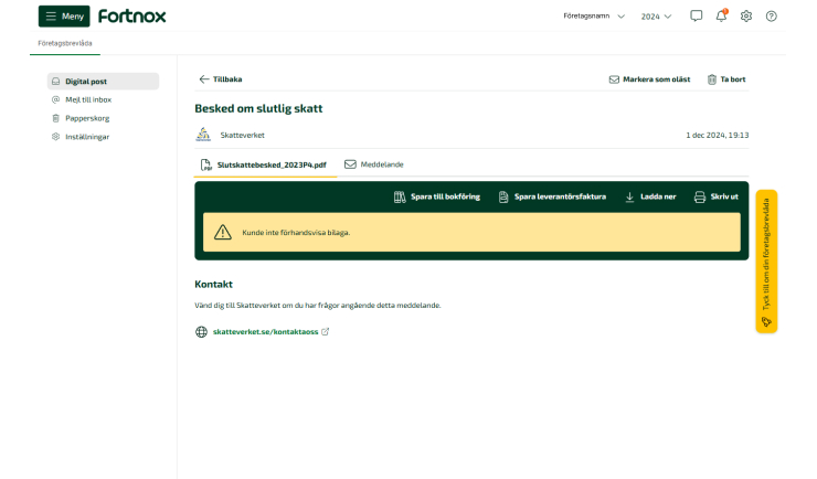
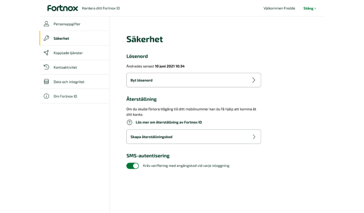
I created high fidelity mockups in Figma and then added the design to the teams tasks so they could inspect the file and components.
I worked very closely with the team to specifie any missing interactions that were not covered in the high fidelity mockups. I conducted UX reviews at the 50% and 90% completion stages of each implementation to ensure alignment with the designs prior to the launch.
Since the implementation of the different products we have seen a significant decrease in the number of complaints lodged through the service desk. Additionally, I have received positive feedback from users regarding how I have helped them find and use our products more effectively, saving them a significant amount of time.
Some key takeaways from this project are: